ActiveX to JavaBeans
Gopalan Suresh Raj
Introduction
This article assumes that you
know how to create JavaBeans and have an understanding of COM.
There are a number of ActiveX
components which have been developed over time, both for the
Internet and for other software projects. In fact, most of the
organizations and developers out there have all along been
investing all their component development resources on ActiveX. A
major limiting factor for these components is that they are
platform specific and will run only on Wintel platforms. How do
companies and their customers leverage their existing investment
to gain an early foothold in the new JavaBean market? How do they
convert their existing ActiveX and OCX components to JavaBeans?
In this article, we will go
through one whole cycle of creating a simple, yet fully
functional ActiveX control and converting it to a fully
functional JavaBean which is 100% Java compatible. To illustrate
the process, we will create a simple Progress Indicator ActiveX
control using Visual C++ and convert it to a JavaBean using The
Migration Assistant. We will work with the generated code to
create the Progress Indicator Bean. We will then package it and
run it in the Beanbox.
| Note:
This article is not a discussion of the theory behind
COM. Except for a very cursory introduction, we are not
going into all the intricacies of creating ActiveX
components. There are tomes of other literature that you
can refer to, to learn more about this technology from
Microsoft. |
An
Introduction to ActiveX Controls
| Like JavaBeans, ActiveX controls are
functional pieces of code that are packaged into a
reusable component which offers some guarantees about how
it interacts with its clients. As mentioned in the earlier article, an
ActiveX control is a COM object. In its previous avatar,
it was called an OLE custom control which had to
implement at least fourteen interfaces. At a minimum, the
only requirement to convert a Java class to a Bean is
that the class should implement the interface java.io.Serializable.
You may know that Interfaces and classes defined in the
package java.beans have to be implemented
as defined to make it a more useful bean. Similarly, an
ActiveX control at a minimum has to implement one
interface - The IUnknown interface.
Implementing the other thirteen interfaces is optional
for an ActiveX control. Reducing the number of interfaces
to implement, makes it possible to create smaller and
faster controls. The beauty of ActiveX controls is that
they can run as-is not only in Web Browsers but in a wide
variety of containers. Visual C++, Visual Basic,
Microsoft Access, Microsoft Internet Explorer and Delphi
to name a few, are some of the containers that can run
ActiveX controls. ActiveX controls feature a two-way
communication with their container, and they can interact
among each other.
|
Interfaces required for an OLE
control:
1.
IUnknown
2. IClassFactory or IClassFactory2
3. IConnectionPointContainer
4. IDataObject
5. IDispatch
6. IOleCache2 ( optional )
7. IOleControl
8. IOleInPlaceActiveObject
9. IOleInPlaceObject
10. IOleObject
11. IPersistStorage*
12. IPersistStream*
13. IPersistStreamInit*
14. IProvideClassInfo
15. IRunnableObject
16. ISpecifyPropertyPages
17. IViewObject2
* denotes
that an OLE control has to implement any one of
these interfaces. |
|
ActiveX
Controls on Visual C++
In the early days of Windows
programming, even creating simple programs involved a lot of the
same repetitive code where the programmer had to specify dozens
and dozens of options. Visual C++ simplified this repetitive
process by creating wizards. Visual C++ ships with five
"wizards" that are used to simplify developing your
Windows programs. It also ships with a lot of example code. So
when creating Windows programs, you use these wizards to generate
the skeletal application framework on which you can build.
There are three ways to creating
ActiveX controls using Visual C++.
ActiveX
Template Library ( ATL )
This is a library, based on C++
templates, that allows you to create ActiveX interfaces in a
simplified fashion. ATL can be used to create single-threaded
objects, apartment-model objects, free-threaded objects or both
free-threaded and apartment-model objects. Writing ActiveX
controls using ATL requires intimate knowledge of how OLE
controls communicate with their container.
BaseCtrl
Framework
This is an example shipped with
Visual C++ that you can use as a starting point to create ActiveX
controls. It is much simpler than ATL, but still requires more
knowledge of OLE than MFC.
Microsoft
Foundation Classes ( MFC )
This is a C++ library written to
simplify a lot of Windows programming tasks including creating
ActiveX controls. This is the simplest method to create ActiveX
controls since MFC controls are easy to write. When programming
using MFC, your focus is on your control’s behavior, not on
the intricacies of OLE interfaces.
The
MFC Way
Since creating ActiveX controls
through MFC is the easiest, let us use this method to create our
sample control. You don’t need to have an in-depth insight
into MFC or Windows programming to follow this. Sit back, relax
and work along each of the steps described below and you will see
how easy it is to create ActiveX controls with so little effort
and understanding.
The
Progress Indicator ActiveX control
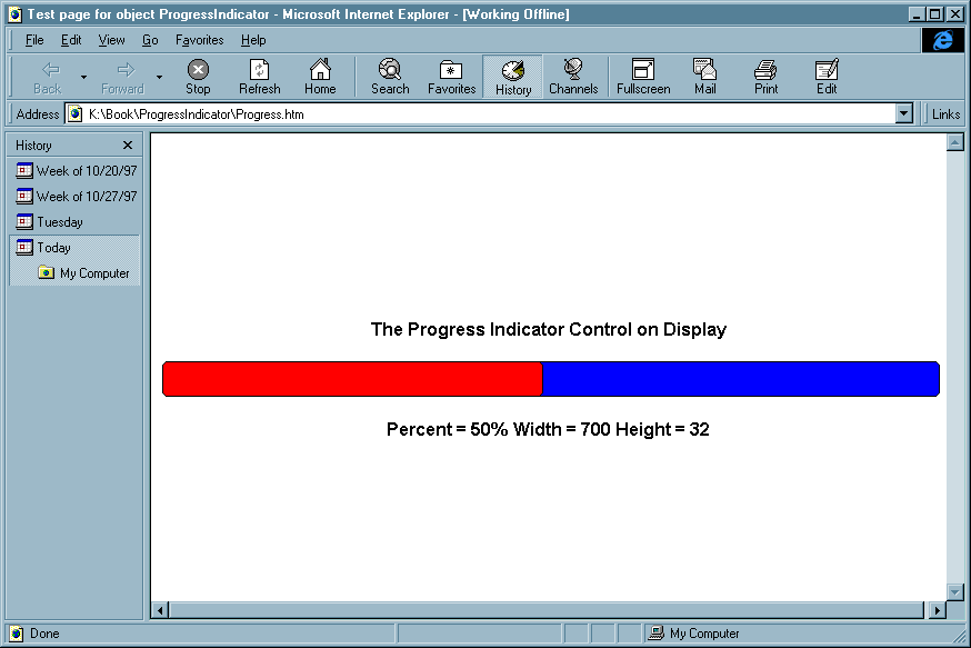
Fig 1 : Shows the Progress Indicator
ActiveX Control running on IE 4.0
|
The
ProgressIndicator control ( see Fig 1 ) is an ActiveX
control that displays a progress bar. It has a Percent
custom property defined through which we can set its
indicator. It has a Width and a Height property to change
its dimensions. It exposes stock properties Backcolor and
ForeColor. (We will discuss Stock Properties in the
section on Properties). There is an AboutDialog() custom
method defined. But there are no custom events that it
responds to. |
Creating
our Control
Let us now create the
ProgressIndicator ActiveX control using the Visual C++ Appwizard.
From Visual C++ ver 5.0 select "New" on the File menu,
then select the Projects tab. From the list of Wizards, select
the MFC ActiveX ControlWizard to create an ActiveX control using
MFC. Fill in the name of the Project as ProgressIndicator and the
Location i.e. the directory in which you want the control placed.
Ensure that the Win32 checkbox is checked under Platforms. Click
on OK.
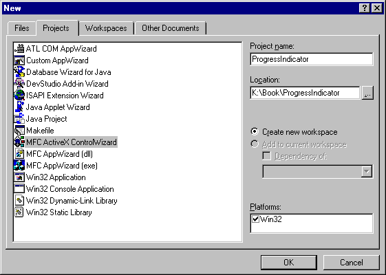
Fig 2 -
Shows how to create the ProgressIndicator Skeleton using
Visual C++ ver 5.0 AppWizard
|
Clicking OK
will start the MFC ActiveX ControlWizard. While it looks
as though you have two pages of options, there are really
three. You access the third page by clicking the
"Advanced" button on the second page. We are
going to use all the default options, so don’t
change anything. Just take a look at the options and
click "Finish" when you are done. After you
click "OK" on the summary page, the MFC ActiveX
ControlWizard will generate your new project. At this
point the project is ready to go. If you want to see it
before we add more features to it, you may go ahead and
build it from the "Build" menu or by pressing
the F7 key. This creates the ProgressIndicator.ocx file.
The default extension for an ActiveX Control is OCX. |
The OLE
Test Container
After building your control, it
is easy to test it using the "OLE Control Test
Container" that comes with Visual C++. Select "OLE
Control Test Container" from the Tools menu. The Test
container comes up. Pick "Insert OLE Control" from the
Edit menu and select your control the "ProgressIndicator
class" from the list box. Since we have not added any
drawing code, we get the Control-wizard provided code, which
draws an ellipse that fills the control area. You can see that
the control automatically scales the ellipse by resizing the
control.
You can view and change the the
control’s properties, call its methods and view a log of
events fired. You can also invoke the controls blank property
page from this container.
The
Simplest MFC ActiveX control
Unlike MFC applications which
are huge, ActiveX controls created using MFC are simpler and
smaller. At a minimum, they contain only three classes. The name
of our sample control is ProgressIndicator and the names of our
classes are :
- CProgressIndicatorApp
- the module class,
- CProgressIndicatorCtrl
- the control class and
- CPropertyIndicatorPropPage
- the property page class.

CProgressIndicatorApp,
the control module class is derived from COleControlModule
which in turn is derived from CWinApp.

CProgressIndicatorCtrl,
the control window class is derived from COleControl
which in turn is derived from CWnd

CProgressIndicatorPropPage,
the property page class is derived from COlePropertyPage
which in turn is derived from CDialog.
Adding
features to our control
Let us now go ahead and add
features to the skeletal code that was generated for us by the
Visual C++ ControlWizard. Along the way, we will discuss the
features that standard ActiveX Controls should implement to make
them what they are. As we discuss these features, wherever
possible, we will see how they compare with the JavaBeans
standard.
Properties
Properties are attributes of an
ActiveX control just as they are in JavaBeans. One important way
for a container to manipulate its controls is by initializing and
changing its properties. Think of Properties as exposing the
variables inside a control. When you insert a control into a
container in design mode, you have a chance to set its initial
properties. The control passes any changes that are made to it
back to the container. The container is responsible for saving
the properties the control asks it to save. The control reads and
writes its properties in the DoPropExchange. In
this way, the state of the control is persistent, and we say the
control "Implements Persistence". This
process is also referred to as Serialization in
JavaBeans. It is the container’s responsibility to save
these properties when it saves the control’s representation.
When the container is run and creates the control, it must
provide the control with these initial property values. In HTML
pages, the properties are saved as <PARAM>
tags inside the <OBJECT> tag that specifies
how to create the control.
There are several categories and
sub-categories of properties.
- Control Properties
- Custom Properties
Stock
Properties
- Container Properties
- Ambient Properties
Extended
Properties
Custom
Properties
Custom Properties are
implemented by the code in your control. You will typically have
a variable in your control class to hold these properties. As in
JavaBeans, you can implement them via Getter/Setter
methods to work in any way you choose. In JavaBeans, this process
is called Customization. Customization is the
process of configuring a bean for a particular task.
ClassWizard offers two choices
when implementing a custom property - as a pair of Get/Set
methods, or as a member variable. In general, using a pair of Get/Set
methods is more flexible for three reasons.
- You can validate changes to
the property.
- You can represent the data
in any way you choose.
- If you want your property
to be either read-only or write-only, it must be
implemented with Get/Set methods.
You can specify only one
"default" property. In the ProgressIndicator, Percent
is the default property. Note that the default property shows up
in the container’s property list as _Percent.
This means that in your container, you can write:
ProgressIndicator1
= 20;
rather than:
ProgressIndicator1.Percent
= 20;
| Note
that the default property shows up in the
container’s property list as _Percent. You
should not use this property. Use Percent
instead. This extra property is an artefact of the way
MFC implements default properties. |
Properties
implemented using Getter/Setter methods
This is a very flexible method
and hence is probably the better of the two methods for
implementing properties. It allows you to store the property in
any way you choose. It also allows you to implement validation
before setting the property values. It also allows you to create
read-only and write-only properties.
When you create the custom
property it is easy to make it read-only or write-only. Just
delete the name of the Get method to make it
write-only, or delete the name of the Set method to
make it read-only.
The Percent
property in ProgressIndicator is implemented as a pair of Getter/Setter
methods. Use the Add property button on ClassWizard’s OLE
Automation tab and type "Percent" in the External name
drop-down box. Select short as the type, then click
on the Get/Set methods. Check the method names,
then click OK. To make Percent the default
property, select it while on the OLE Automation tab and click the
Default Property checkbox.
When you have done all this,
ClassWizard will modify your dispatch map to include:
DISP_PROPERTY_EX(CProgressIndicatorCtrl,"Percent",GetPercent,SetPercent,VT_I2)
DISP_DEFVALUE(CProgressIndicatorCtrl,
"Percent")
It will also modify your TypeLib
source file i.e. your .ODL file to include the following:
[id(1)]
short Percent;
[id(0)]
short _Percent;
The fact that the second
declaration has an ID of 0 is what makes Percent
the default property. MFC takes care of the difference between Percent
and _Percent.
ClassWizard also generates
skeletons for the GetPercent and SetPercent
methods. We can add the member variable m_percent
using a right-click on the CProgressIndicatorCtrl
in ClassView and add code to the methods as follows:
#define
PERCENT_MIN 0
#define PERCENT_MAX 100
short
CProgressIndicatorCtrl::GetPercent( void )
{
return m_percent;
}
void
CProgressIndicatorCtrl::SetPercent( short
nNewValue )
{
if( ( nNewValue >= PERCENT_MIN
) && ( nNewValue <= PERCENT_MAX ) )
{
m_percent = nNewValue;
InvalidateControl( );
SetModifiedFlag( );
}
else
{
ThrowError(
CTL_E_ILLEGALFUNCTIONCALL, "Percent
parameter out of range" );
}
}
GetPercent is
simple, but SetPercent requires some explanation.
First, we check to see if the value being used is valid. If it is
valid, we set m_percent and update the control. InvalidateControl
redraws the control and SetModifiedFlag lets MFC
know that a property has changed.
If the value is not valid, we
throw an error using the ThrowError member
function. This function is only used in methods, including
Get/Set methods. In other situations, use FireError
to fire the stock Error method.
| Note
that SetPercent method will not be called when the
control is initialized. Only the Percent member is
changed. |
Properties
implemented using member variables
Another way you can add custom
properties, is by asking ClassWizard to implement them as member
variables. This way, MFC implements your Getter/Setter methods
and you dont have to code them yourself.
However, this method has three
major disadvantages:
- It is not possible to
validate the value to which your property is being set.
- You cannot make the
property read-only or write-only.
- The member variable has to
be of the same type as the property
If the above disadvantages
outweigh the benefits of having the properties as members, you
can go ahead and implement them this way. For example, if the
type of the read/write property is boolean, it makes sense to
implement that property as a member variable.
ClassWizard creates a
notification method which will be called when the property
changes, by default. If we had implemented Percent
as a member variable, we would have called InvalidateControl
and SetModifiedFlag from this notification method.
To implement a property as a member variable, click on Member
variable in the last step of the wizard. If you dont want a
notification method, clear the name in ClassWizard before you
click OK.
Implementing
Persistence
You have read about
Serialization of JavaBean objects. The java.io
package provides object serialization in JavaBeans. Serialization
is the process by which we "freeze-dry" an object by
converting its state to a blob of data to be packaged away for
later use. In ActiveX controls, the DoPropExchange
method contains code that the ClassWizard adds to save your
properties at design time so they can be reloaded at run-time.
Add code to the DoPropExchange
method as follows. The last parameter to PX_Short
is the propertys’ default values. Validate the
initialization data to ensure that we are safe for initializing.
It is possible for a container to pass an invalid value to the
control, so it’s important to check it both here and in the
Setter methods.
void
CProgressIndicatorCtrl::DoPropExchange(CPropExchange*
pPX)
{
ExchangeVersion(pPX, MAKELONG(_wVerMinor,
_wVerMajor));
COleControl::DoPropExchange(pPX);
// Set the defaults for the control's
properties
PX_Short( pPX, "Percent", m_percent,
PERCENT_MIN );
PX_Short( pPX, "Width", m_width,
DEFAULT_WIDTH );
PX_Short( pPX, "Height", m_height,
DEFAULT_HEIGHT );
if( pPX->IsLoading( ) )
{
if( ( m_percent < PERCENT_MIN )
|| ( m_percent > PERCENT_MAX ) )
{
m_percent =
PERCENT_MIN;
}
if( m_width < 0 )
{
m_width =
DEFAULT_WIDTH;
}
if( m_height < 0 )
{
m_height =
DEFAULT_HEIGHT;
}
}
}
Stock
Properties
There are some properties that
are likely to be implemented so frequently that MFC provides
standard implementations for them. These are called Stock
properties.
| Note:
Stock properties use standard names and dispids that are
reserved and should not be overridden by any control
properties, events or methods that you create. |
To use these properties, just
add them to your control using the ClassWizard. MFC automatically
provides persistence for these properties. You can check out the
list of Stock Properties by looking up Stock Methods/Properties
in the class member list for COleControl. You can
use these predefined methods provided in COleControl
to access these Stock properties.
| Note:
One important thing to remember about stock properties is
that they are stored as OLE_COLOR, not as a
COLORREF. |
The ProgressIndicator example
uses a couple of Stock Properties: BackColor and ForeColor.
To add these stock properties, use the AddProperty button on
ClassWizard’s Automation tab and select BackColor
and ForeColor in the External Name drop-down box.
When you are done, ClassWizard
will modify your dispatch map to include:
DISP_STOCKPROP_BACKCOLOR()
DISP_STOCKPROP_FORECOLOR()
It will also modify your typelib
source i.e., your .ODL file to include the following:
[id(DISPID_BACKCOLOR),
bindable, requestedit] OLE_COLOR BackColor;
[id(DISPID_FORECOLOR),
bindable, requestedit] OLE_COLOR ForeColor;
We can now go ahead and call GetBackColor
and GetForeColor to get the colors to paint our
control with. As mentioned above, these stock properties are
automatically persistent.
Ambient
Properties
Just as the control has Stock
and Custom properties, the Containers too have Standard Ambient
and Extended Ambient properties. These properties are therefore
implemented by the ActiveX container rather than the control.
These properties describe the ambience surrounding the control.
You do not have to do anything to access these properties except
call the appropriate methods.
Standard
Ambient Properties
These are properties for which
dispatch Ids are predefined by OLE. Most of these properties can
be accessed by calling methods of COleControl. To
access the few ones that do not have member functions to call use
the GetAmbientProperty method present in COleControl.
Our ProgressIndicator example
uses the ambient property BackColor to paint the
area outside of the control to blend into the control’s
background.
void
CProgressIndicatorCtrl::OnDraw( CDC* pdc, const
CRect& rcBounds, const CRect& rcInvalid )
{
// erase background using container's
background color
CBrush brAmbientBack( TranslateColor(
AmbientBackColor( ) ) );
pdc->FillRect( rcBounds, &brAmbientBack );
//
draw the control
DrawProgressControl( pdc, rcBounds );
}
In the above code snippet, AmbientBackColor
reads the ambient background color. Since this returns an OLE_COLOR,
it needs to be translated before we can create the brush for
painting the background.
Extended
Ambient Properties
Just as controls define their
own custom properties, ActiveX containers too implement their own
ambient properties. These properties are called extended Ambient
Properties. If you know the property’s dispatch ID and its
type, you can access it using the GetAmbientProperty
method.
Change
Notifications
Whenever ambient properties
change, the control will be notified. In the ClassWizard’s
Message Map tab, you will find the OnAmbientPropertyChange.
If you want your control to respond and do something whenever
this notification comes in, override OnAmbientPropertyChange.
We have to override this method and repaint the control if the
background color changes.
void
CProgressIndicatorCtrl::OnAmbientPropertyChange(
DISPID dispid )
{
// Force a repaint if ambient background
changed or there were other
// changes
if( ( dispid == DISPID_AMBIENT_BACKCOLOR )
||
( dispid == DISPID_UNKNOWN ) )
{
InvalidateControl( );
}
COleControl::OnAmbientPropertyChange(dispid);
}
The code checks and sees which
notification we received. It then forces repaint of the control
if the ambient background changed.
| Note:
Note here that even if more than one ambient property
changes at a time, only one call to OnAmbientPropertyChange
will be made. |
The call to
OnAmbientPropertyChange may also pass DISPID_UNKNOWN
as the DISPID. We check for that situation and
force a repaint just to be safe.
Methods
Methods allow the control user
to call specific functionality within the control. Methods expose
the function calls of a control. These are applied to the control
through the IDispatch interaface. There are two
types of methods, Custom methods and Stock methods.
Custom
Methods
Most of the methods your control
uses will be custom methods. Stock methods are implemented by
MFC, Custom methods are implemented by you. There is only one
custom method that our example has and it is implemented by the
code generated by ClassWizard to display the AboutDialog.
void
CProgressIndicatorCtrl::AboutBox( void )
{
CDialog
dlgAbout(IDD_ABOUTBOX_PROGRESSINDICATOR);
dlgAbout.DoModal();
}
However, you can define as many
custom methods that you want to extend the functionality of your
control.
Stock
Methods
MFC provides implementation for
a couple of Stock methods. These methods can be easily added to
your project using ClassWizard. You dont even have to write any
code for these.
| Note:
The ActiveX control specification currently provides two
standard methods that should be implemented in your
control if it supports the behavior. These methods are Refresh
and DoClick. |
The ProgressIndicator control
implements the Refresh stock method, which forces
the control to redraw itself. To add the method to the control,
use the Add Method button on the ClassWizard’s Automation
tab and select Refresh in the External Name
drop-down box. ControlWizard will modify your dispatch map to
include:
DISP_STOCKFUNC_REFRESH()
It will also modify the Typelib
source .ODL file to include :
[id(DISPID_REFRESH)]
void Refresh();
This method is handy if the
container knows it is drawn on top of the control and wants the
control to redraw itself.
Events
Events are notification messages
passed to the container by the control when something of interest
has happened. The control does this by "firing" an
event, which the container can handle with its own code. Events
are a very powerful addition to ActiveX controls. OLE Automation
objects can only respond asynchronously while informing their
containers that something happened. There are two types of
Events, Custom Events and Stock Events.
Custom
Events
You are aware that classes in
JavaBeans can define new event types to send messages to one
another. To implement user-defined or other events in JavaBeans,
you derive your classes from the class java.util.EventObject.
Similarly, Custom Events are events that are defined by the user
and are specific to a particular ActiveX control. Many of the
events that your control fires will be custom events. Custom
events can pass parameters to provide more information about the
situation that caused the event to be fired. The
ProgressIndicator control has no custom events.
Stock
Events
MFC provides some stock events,
mainly having to do with mouse clicks and key presses. Two Stock
events worth mentioning are the Error event which
we will discuss in a bit, and the ReadyStateChanged
event. The ReadyStateChanged event can be fired by
your control to notify your container that its ready state has
changed ( for instance from Loading to Interactive to Complete ).
This can be useful if you need to download a lot of data before
its ready to use the control.
Drawing
our Control
Unlike other Windows programs,
the drawing code for ActiveX controls must meet some special
requirements.
- Your Control should
draw on demand. Your control will be asked to
draw itself whenever the container needs it to. The
container will pass in a device context and two
rectangles. The bounding rectangle and a rectangle that
encloses all the invalid regions. You must draw at least
the pixels enclosed by the invalid rectangle but may not
draw any pixels outside the bounding rectangle.
| Note:
The bounding rectangle’s upper left corner is not
guaranteed to be at (0, 0). It usually will be drawing a
control that is in an active state. |
- You must paint your
background. Unlike painting a window or drawing a
view, you must paint your background in the
control’s OnDraw method. Background
painting is not done automatically, nor is it done in
some other function.
- You may not assume
anything about the DC you’ve been passed.
Therefore, you should select the pens, brushes, fonts and
colors you need when you draw your control. Some
containers may pass your control a metafile DC in some
situations, especially when printing. In order to work
properly when drawing to a metafile, you must restrict
your function calls to those supported in metafiles.
Finally, you must always select the old drawing objects
back into the DC before your drawing function exits.
- The container not the
control determines the control’s size and position.
Hence you may either need to scale your control to fit or
you may need to provide scaling. Our ProgressIndicator
control does neither!
The drawing code snippet is
shown below.
void
CProgressIndicatorCtrl::OnDraw( CDC* pdc, const
CRect& rcBounds, const CRect& rcInvalid)
{
// erase background using container's
background color
CBrush brAmbientBack( TranslateColor(
AmbientBackColor( ) ) );
pdc->FillRect( rcBounds, &brAmbientBack
);
// draw the control
DrawProgressControl( pdc, rcBounds );
}
void
CProgressIndicatorCtrl::DrawProgressControl( CDC* pdc,
const CRect& rcBounds )
{
CBrush brush;
CRect rect = rcBounds;
CBrush* pOldBrush = NULL;
COLORREF crBackColor = GetBackColor( );
COLORREF crForeColor = GetForeColor( );
// set the height and width of the control to
be drawn
rect.right = rect.left + m_width;
rect.bottom = rect.top + m_height;
// Create a solid brush with background color
if( brush.CreateSolidBrush( crBackColor ) ==
TRUE )
{
// Select the brush into the Device
Context and save the old one
pOldBrush = ( CBrush*
)pdc->SelectObject( &brush );
pdc->RoundRect( rect.left,
rect.top, rect.right, rect.bottom,10,10);
brush.DeleteObject( );
// Create a solid brush with
foreground color
if( brush.CreateSolidBrush(
crForeColor ) == TRUE )
{
// Select the brush
into the Device Context and draw the
// indicator
pdc->SelectObject(
&brush );
int nWidth = ( m_width
* m_percent )/100;
pdc->RoundRect(
rect.left, rect.top, ( rect.left+nWidth ),
rect.bottom, 10, 10 );
brush.DeleteObject( );
}
// Restore the Old Brush to the
Device Context
pdc->SelectObject( pOldBrush );
}
}
Implementing
Property pages
ActiveX controls support
property pages so that the control’s properties can be
easily modified. The default page generated by AppWizard is blank
except for a static text control that informs you to implement a
property page for your control. Creating a property page for an
ActiveX control is even simpler than creating a dialog box in
MFC, since the ClassWizard will write code to transfer data
between your properties and your class members. To begin with,
edit the dialog template to create the controls you like for your
property dialog’s user-interface.
ProgressIndicator has three
properties. The Percent, Width and Height properties. For each of
these properties, we should add a static and edit control. Once
we have the dialog template ready, adding the code is easy. In
the ClassWizard’s Add Member Variable box, we have to name
each of the member variables m_percent, m_width and
m_height and tell it to what property it has to attach to.
ClassWizard added all the code, added declarations in the header
short
m_height;
short
m_percent;
short
m_width;
and initializations for the
member variables.
CProgressIndicatorPropPage::CProgressIndicatorPropPage()
:
COlePropertyPage(IDD, IDS_PROGRESSINDICATOR_PPG_CAPTION)
{
//{{AFX_DATA_INIT(CProgressIndicatorPropPage)
m_height = 0;
m_percent = 0;
m_width = 0;
//}}AFX_DATA_INIT
}
It also added the lines to the DoDataExchange
method.
void
CProgressIndicatorPropPage::DoDataExchange(CDataExchange*
pDX)
{
//{{AFX_DATA_MAP(CProgressIndicatorPropPage)
DDP_Text(pDX, IDC_HEIGHT, m_height,
_T("Height") );
DDX_Text(pDX, IDC_HEIGHT, m_height);
DDP_Text(pDX, IDC_PERCENT, m_percent,
_T("Percent") );
DDX_Text(pDX, IDC_PERCENT, m_percent);
DDV_MinMaxInt(pDX, m_percent, 0, 100);
DDP_Text(pDX, IDC_WIDTH, m_width,
_T("Width") );
DDX_Text(pDX, IDC_WIDTH, m_width);
//}}AFX_DATA_MAP
DDP_PostProcessing(pDX);
}
Message
Handling
You can add message handlers to
your window, which in this case is derived from COleControl.
Handling Windows messages is very much like handling messages in
any MFC application. The ProgressIndicator control does not
respond to any Windows message.
Error
Handling
Every control may need to
communicate with its container and notify it of any errors. There
are two ways of notifying the container of errors, depending on
whether the code that detected the error is in a method call or
not.
Within a method (including Get/Set
methods), call COleControl::ThrowError. Our
ProgressIndicator example does this if the property that is being
set is invalid.
void
CProgressIndicatorCtrl::SetPercent( short nNewValue )
{
if( ( nNewValue >= PERCENT_MIN ) && (
nNewValue <= PERCENT_MAX ) )
{
m_percent = nNewValue;
InvalidateControl( );
SetModifiedFlag( );
}
else
{
ThrowError(
CTL_E_ILLEGALFUNCTIONCALL, "Percent parameter out
range" );
}
}
In other situations such as code
that processes Windows Messages, call COleControl::FireError.
| Note:
To call COleControl::FireError, you must
add the Error stock event to your control |
Caveat
Emptor!
ActiveX code written using MFC
is not small. If you are developing ActiveX controls that do not
need the full functionality of an OLE control, you may be better
off with another option ( either use ATL or BaseCtrl Framework ).
The other problem that you may
run into is that to use an ActiveX control written using MFC, the
correct version of MFC and C Runtime DLLs need to be installed on
the user’s machine. It may be heartening to know that
Internet Explorer ships with MFC DLLs. You can be assured that
most users would have them installed on their machines already.
You still should be prepared to provide these DLLs to users who
do not use Internet Explorer.
Security
Issues
Internet Explorer (IE)
implements two mechanisms to ensure that users can load and run
ActiveX controls without harming their systems. It does this by :
- Checking the signature of
the code it installs. If the signature is missing or
invalid, it notifies you and allows you to decide what to
do.
- If your Web page attempts
to script or initialize the control, the browser will
ignore the control.
To get around the dialog boxes
it pops up and to run at all in Internet Explorer, you must sign
your control and mark it as safe.
Signing the code means you add
data to the control so that IE can ascertain that
- The control has not been
modified since it was signed
- The claimed author is
actually the author.
Signing the code requires an
electronic "certificate" issued by a "certificate
authority". You must guard the private key that is provided
to you carefully since if someone obtains them, they can sign
their code in your name. You can read more about code signing in
the ActiveX SDK documentation.
There are two methods for
letting IE know that your control is safe:
- Manipulate the registry to
include component categories for safety and add an entry
to say that your control is safe or,
- Implement the IObjectSafety
COM interface.
Registry
Manipulation
A simple method for marking
controls safe for scripting and initialization is to add the
necessary entries to the registry. Although it is possible to do
it by hand or with the .REG file, self-registering controls
should do this automatically when they register. Since this topic
is beyond the scope of this article, please refer to the ActiveX
SDK documentation for additional information.
Implementing
the IObjectSafety Interface
The other way to mark a control
safe is by implementing the IObjectSafety
interface. Although this is more complicated than the previous
method, it has its own advantages. It allows the container to
query the control using the GetInterfaceSafetyOptions
to ensure that the control is safe. It also allows the control to
make itself safe using the SetInterfaceSafetyOptions.
This flexibility allows you to write your control to make itself
operate both in safe and unsafe modes. If the container requests
your control to be safe for scripting or initialization, your
control can change modes and behave accordingly. If your
container does’nt care about safety, your control can
run in unsafe mode and exploit the power of the machine!!!
Since further discussion of this topic is beyond the scope of
this article, please refer to the ActiveX SDK documentation for
additional information.
Running
the control
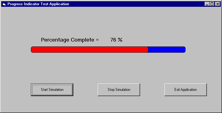 |
The figure
shows the ProgressIndicator ActiveX control in action.
When the start simulation button is pressed, the
simulation starts and the Progress bar moves from 0 to
100% and back to 0%. It keeps doing it till you either
stop the simulation or exit the application. The source
code for the simulation was written using Visual Basic
5.0 and it used our ProgressIndicator control. You should
be able to find the source code for this simulation in
the ProgressIndicator Test directory. It is also possible to run this
ActiveX control on a Web-Browser. The use of the ActiveX
Control Pad was demonstrated to you in the previous
article. You can use it to generate simple HTML code
intermixed with either JavaScript or VBScript to create
your Web pages. Find areas where you can use our
ProgressIndicator control in your web applications as a
small assignment! The HTML and Javascript code which
demonstrates how you would use our control on a Web page
should be found in ProgressIndicator.htm.
|
The
Migration Assistant
Taligent, Inc., with support
from JavaSoft has developed a tool that will allow anyone to
convert their ActiveX components to JavaBeans.
This tool, called The Migration
Assistant, uses ActiveX information available in the registry or
a disk file, to create an equivalent bean with the same
functionality as the original ActiveX control. It does this by
creating a set of JavaBean methods, properties and enums to
implement the same functionality. The Migration Assistant reads
information from the ActiveX type library and creates a JavaBean
component. The generated code skeleton maps property definitions
in the ActiveX control to its Bean equivalent. It maps
Windows-specific data types to their equivalent Java types.
| VARIANT Type |
Windows-specific meaning |
Java type |
| VT_NULL |
NULL value |
null |
| VT_I2 |
2-byte signed integer
|
short |
| VT_I4 |
4-byte signed integer
or long |
int |
| VT_INT |
4-byte integer |
int |
| VT_UINT |
unsigned integer |
int |
| VT_R4 |
4-byte read value |
float |
| VT_R8 |
8-byte real value |
double |
| VT_BSTR |
BSTR - binary string |
java.lang.String |
| VT_DISPATCH |
IDispatch FAR pointer |
java.util.EventObject |
| VT_BOOL |
Boolean |
boolean |
| VT_UNKNOWN |
IUnknown FAR pointer |
java.awt.Component |
| VT_I1 |
character |
char |
| VT_UI1 |
unsigned character |
byte |
| VT_UI2 |
unsigned 2-byte
integer |
short |
| VT_UI4 |
unsigned 4-byte
integer |
int |
Figure : Shows
a mapping of the VARIANT enumeration types to their Windows
specific meaning and to their equivalent Java types.
In addition to creating accessor
methods for the ActiveX control Properties, Migration Assistant
also adds support for both Bound and Constrained Properties. It
maps ActiveX Stock events to their respective Bean equivalents.
It also adds support for event registration and deregistration.
It does this by implementing the EventObject, the listener
interface and user-defined objects.
This tool comes with an
excellent graphical interface. It displays three categories of
information about the ActiveX component to be converted. It shows
its properties, methods, events and enums. You can select the
elements you want to include in the final bean. You can either
choose to produce a bean that implements the entire ActiveX
component using default mappings or you may customize your output
to create a customized bean.
Once the elements to migrate are
selected, a 100% Java compatible bean framework is generated for
your subsequent component implementation. The generated event
code is fully compliant with JDK 1.1 and the JavaBean
specification. The code incorporates the JavaBeans event handling
model.
The bean is now ready to accept
your component implementation code. This involves converting your
C++ code to JavaBeans code and placing it into the generated bean
framework.
Benefits
to using the Migration Assistant
- This tool puts you on the
fast track to converting your ActiveX and OCX controls to
JavaBeans. It analyzes the existing ActiveX binary to
create a skeletal JavaBean with all the bean equivalents
of the original ActiveX interface. You get a headstart to
converting your ActiveX components to a beans framework,
without even writing a single line of code.
- Building components for
both the ActiveX and JavaBean markets using one
development technology is the most cost effective way to
deliver to the existing marketplace and to gain a faster
market presence in both technologies.
- With the promise of an open
architecture and the ability to run the same source image
on different platforms, JavaBeans is an ideal technology
to cater to the widest class of clientele. This tool
gives ActiveX developers an opportunity to port their
ActiveX components to other platforms while still
minimizing a lot of development effort.
- Having established its
portability, security and usefulness in a networked
world, Java is the language of choice for taking these
existing powerful ActiveX components to other platforms.
Migration Assistant makes it easy to get there.
Availability
and Installation
The Migration Assistant can be
downloaded from any of the three sites :
It is being packaged with
Taligent’s VisualAge WebRunner Toolkit.
JavaSoft has promised that future versions of the Bean
Development Kit will include this tool. IBM’s VisualAge
for Java will also come with this tool included.
Converting
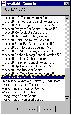
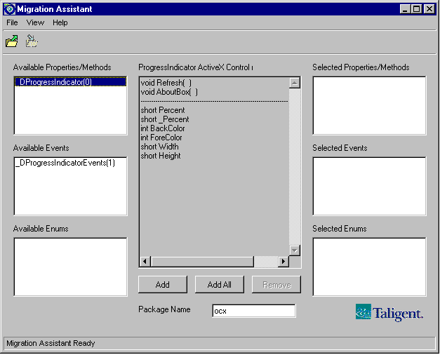
our ActiveX Control to a JavaBean
| Let us now
go through the steps to convert our ProgressIndicator
ActiveX Control to a JavaBean. Start-up the Migration Assistant from the
Start menu. The Migration Assistant fires up.
Select our ActiveX
control that needs to be migrated to a bean
- From the File menu,
choose the "Select OCX" menu option.
You can also click the Select OCX icon on the
toolbar. The Available Controls dialog box comes
up.
- The Available
Controls dialog shows all the available controls
installed on your machine. From this list, select
the ProgressIndicator control. Alternatively, you
can click on the Browse button in this dialog box
to bring up an Open dialog from where you can
select a .ocx or .tlb file directly.
- As soon as you
click on OK to close the dialog box, the
properties, methods, events and enum interfaces
of the ActiveX control chosen appear on the
left-hand list boxes of the Migration Assistant
window.
|
|
 |
Select the
control’s interfaces that you wish to migrate.
- From the list boxes
titled Available... in the Migration Assistant
dialog box, choose all the interfaces that you
wish to migrate. To add interfaces one at a time
to the list of interfaces selected for migration,
click on the interface item and then the Add
button. The interface will be added to the
Selected Interfaces list on the right hand side
of the dialog box.
- To remove an
interface from the Selected Interfaces list,
select the entry in the list and then click the
Remove button.
-
- To examine the
details of the properties, methods or enums
associated with an interface, simply select the
interface in either the Available or Selected
interface lists. The details will appear
- In our case, let us
add all the available interfaces to the list of
interfaces selected for migration. Simply click
on the Add All button. All the Available
Interfaces will be added to the Selected
interface list.
- Notice that there
is a Package Name edit box. The default package
name is ocx. Fill in the Package Name text field
with the name you wish the package to have.
|
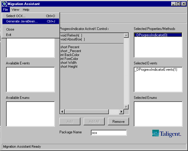
Ask the
tool to generate the bean files.
- Go to the File
menu, choose Generate JavaBean. You can also
click the Generate JavaBean icon on the toolbar.
- In the Save Dialog
box, specify the directory into which you wish
the generated files placed and then click OK. The
Migration Assistant’s status bar will read
"Code Generation complete" when this
operation is over.
- The target
directory will now contain the generated source
files and a build .bat file.
|
|
Problems
with the generated code
The source that is generated by
Migration Assistant looks like this:
package ocx;
import
java.awt.*;
import java.awt.event.*;
import java.util.*;
import java.beans.*;
// ------------------------------------------------------
// PROGRE_1
// Dispatch interface for ProgressIndicator Control
// ------------------------------------------------------
public class PROGRE_1 extends Component {
public void Refresh( ) {
}
public void AboutBox( ) {
}
// Getters
public short getPercent() { return m_Percent; }
public short get_Percent() { return m__Percent; }
// Note: BackColor was skipped as it is already
defined in Component
// Note: ForeColor was skipped as it is already
defined in Component
public short getWidth() { return m_Width; }
public short getHeight() { return m_Height; }
// Setters
public void setPercent( short Percent ) {
m_Percent = Percent;
}
public void set_Percent( short _Percent ) {
m__Percent = _Percent;
}
public void setWidth( short Width ) {
m_Width = Width;
}
public void setHeight( short Height ) {
m_Height = Height;
}
// Member variables
private short m_Percent;
private short m__Percent;
private short m_Width;
private short m_Height;
}
The code that is generated by
Migration Assistant needs modification in order for it to
completely mimic the original ActiveX control. So Java code will
have to be added to make this bean fully functional.
- The generated code just
reflects the exposed public interface of the ActiveX
control. If there are any private methods, it is your
responsibility to code it in. Notice that there is no
paint method. Also there is no validation performed on
the data members before they get set.
//
Setters
public void setPercent( short Percent ) {
m_Percent = Percent;
}
- Migration Assistant does
not handle long file names really well. Notice that the
name of the class that it generated was PROGRE_1,
whereas our ActiveX Control calls it ProgressIndicator.
You may have to change the name of the class in the
generated file.
- Notice that the bean which
is generated is a subclass of java.awt.Component.
Our ProgressIndicator ActiveX control had properties BackColor
and ForeColor. The "Stock
Properties" of the Control have been mapped to the
Component-related properties. Similarly, "Stock
Events" in the control will map to the
Component-related events. Since the ActiveX properties BackColor
and ForeColor match exactly in name with
Component properties, code for this is not generated. A
comment to this effect is placed in the generated code.
//
Note: BackColor was skipped as it is already defined
in Component
// Note: ForeColor was skipped as it is already
defined in Component
- Notice that there are two
Percent properties. One for Percent and the
other _Percent. The _Percent
property has to be removed from the generated code since
it is an artefact of how MFC generated and managed our
code. You may need to remove any references to this
_Percent property wherever you find it in the
generated code.
- Sometimes, generated
methods may collide with methods already defined in Java
base classes such as java.awt.Component or java.util.EventObject
that have different signatures. In such cases, you may
need to change the name of the generated method. This may
cause the interface to appear a wee bit different from
the original ActiveX control.
- In case the ActiveX library
we want to convert, has multiple controls inside of it,
the control you want to convert to a bean must be
selected from the "Available Controls" Dialog
listBox. Do not browse from the Open file dialog to
select it. If the control has not yet been installed,
install it and then select it from the "Available
Controls" Dialog listbox.
- In cases where the ActiveX
control does not have any type information specified, a
message box will alert you to this fact. Currently, you
will have to locate the associated .tlb file manually,
using the file "Open" dialog.
Making
it a Complete Bean
The first thing that we may have
to do is define our constants. Under the Member variables
section, add the following piece of code.
final
int PERCENT_MIN = 0;
final
int PERCENT_MAX = 100;
final
int DEFAULT_WIDTH = 200;
final
int DEFAULT_HEIGHT = 100;
Now we may add validation to our
Setter methods like this. Notice that as soon as we set the
values, we call the invalidate method which forces
the control to paint itself.
public
void setPercent( short Percent ) {
if( ( Percent >= PERCENT_MIN )
&& ( Percent <= PERCENT_MAX ) ) {
m_Percent = Percent;
invalidate( );
}
}
Our next job is to add the paint
so that the control can redraw itself.
public
void paint( Graphics g ) {
int nWidth = 0;
g.setColor( m_BackColor );
g.fillRect( 0, 0, m_Width, m_Height );
g.setColor( Color.black );
g.drawRect( 0, 0, m_Width, m_Height );
g.setColor( m_ForeColor );
nWidth = ( m_Width * m_Percent )/100;
g.fillRect( 0, 0, nWidth, m_Height );
}
The finished code looks like
this. Code fragments that are indicated in Bold is code that we
need to add to the generated skeletal code.
package
ocx;
import
java.awt.*;
import java.awt.event.*;
import java.util.*;
import java.beans.*;
//
-----------------------------------------------------------------------------
// ProgressIndicator
// Dispatch interface for ProgressIndicator Control
//
-----------------------------------------------------------------------------
public class ProgressIndicator extends Component
{
public ProgressIndicator () {
m_Percent = 0;
m_Width = DEFAULT_WIDTH;
m_Height = DEFAULT_HEIGHT;
m_BackColor = Color.blue;
m_ForeColor = Color.red;
}
public
void Refresh () {
}
public
void AboutBox () {
}
// Getters
public short getPercent () { return
m_Percent; }
public short getWidth () {
return m_Width; }
public short getHeight () {
return m_Height; }
public Color getBackColor () { return m_BackColor;
}
public Color getForeColor () { return m_ForeColor;
}
// Setters
public void setPercent( short Percent ) {
if( ( Percent >= PERCENT_MIN )
&& ( Percent <= PERCENT_MAX ) ) {
m_Percent = Percent;
invalidate( );
}
}
public void setWidth( short Width ) {
if( Width >= 0 ) {
m_Width = Width;
setSize( m_Width, m_Height );
System.out.println( m_Width );
invalidate( );
}
}
public void setHeight( short Height ) {
if( Height >= 0 ) {
m_Height = Height;
setSize( m_Width, m_Height );
System.out.println( m_Height );
invalidate( );
}
}
public void setForeColor( Color ForeColor ) {
m_ForeColor = ForeColor;
repaint( );
}
public void setBackColor( Color BackColor ) {
m_BackColor = BackColor;
repaint( );
}
public void paint( Graphics g ) {
int nWidth = 0;
g.setColor( m_BackColor );
g.fillRect( 0, 0, m_Width, m_Height );
g.setColor( Color.black );
g.drawRect( 0, 0, m_Width, m_Height );
g.setColor( m_ForeColor );
nWidth = ( m_Width * m_Percent )/100;
g.fillRect( 0, 0, nWidth, m_Height );
}
// Member variables
final int
PERCENT_MIN = 0;
final int PERCENT_MAX =
100;
final int DEFAULT_WIDTH = 200;
final int DEFAULT_HEIGHT = 100;
private short m_Percent = 0;
private short m_Width =
DEFAULT_WIDTH;
private short m_Height =
DEFAULT_HEIGHT;
private Color m_BackColor = Color.blue;
private Color m_ForeColor = Color.red;
}
Build the code with the javac
compiler and create the ProgressIndicator.class
file.
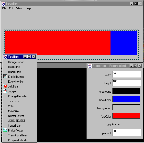
Running
our Bean in a Beanbox
Once you are done modifying the
code, you may need to write a stub file like this one. Create a
file called Stub and type in the following code.
Manifest-Version
1.0
Name:
ocx/ProgressIndicator.class
Java-Bean:
True
Now that you have both the stub
file and the .class file, you can package your bean to run it in
the beanbox. At the command prompt, type in the following to
create a jar file for your bean.
jar
cfn ProgressIndicator.jar stub ocx
Here is how our converted bean
looks like on the beanbox.
Conclusion
In this article, we went through
one whole cycle of creating a simple, yet fully functional
ActiveX control and converting it to a fully functional JavaBean
which was 100% Java compatible. We illustrated the process by
creating a simple Progress Indicator ActiveX control using Visual
C++ and converting it to a JavaBean using The Migration
Assistant. We worked with the generated code to create the
Progress Indicator Bean. We packaged it and ran it in the
Beanbox.
.gif)
|
This
site was developed and is maintained by Gopalan Suresh Raj
This page was first put up on
December 4, 1997. It has since been visited  times.
|
Copyright (c)
1997-98, Gopalan Suresh Raj - All rights
reserved. Terms of use.
|
All products
and companies mentioned at this site,are trademarks of
their respective owners.
|

